Calgary Fire Department
Maltese Cross usage guidelines
The Maltese Cross has long been a symbol for firefighter bravery and service. By using it in a consistent manner with The City of Calgary Visual Identifier, people will understand how firefighters proudly serve the citizens of Calgary. Standardizing the treatment of the Maltese Cross will result in a clear, strong unified voice.
Variations
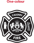
One colour
The one-colour black Maltese Cross can be used as an alternative to the two-colour version. It is to be reproduced in black only; alternative colours are not to be used.
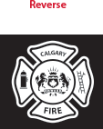
Reversed
This reverse Maltese cross can be used in applications when the two- or one-colour Maltese Cross cannot be reproduced effectively. This option is to be used on a black, grey or blue background only.
Maltese Cross colours
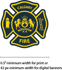
Full colour (CMYK or two Pantone)
This is the preferred application.
The colours used within the Maltese Cross should not be used for graphical purposes. They will only ever be used within the Maltese Cross.
Navy

- Pantone 2965 C
- C82 M58 Y43 K63
- R0 G38 B62
- Hex #00263e
Yellow

- Pantone 108 C
- C0 M14 Y100 K0
- R254 G219 B0
- Hex #fedb00
Hierarchy
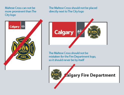
Communications should be City-first to ensure citizens can easily identify the Calgary Fire Department as a municipal government supported service. Although the Maltese Cross is a proud and historical symbol, it should not supersede The City Visual Identifier.
Applications
Collateral
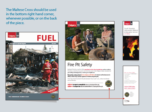
The overall look of communications is clean and simple, with no additional textures and graphical devices to detract from the overall message.
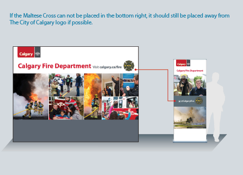
Displays
Displays should be bold and evocative and highlight the diversity of what firefighters do.
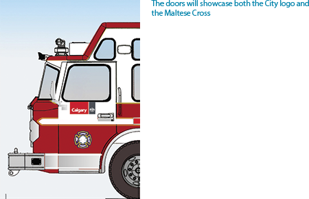
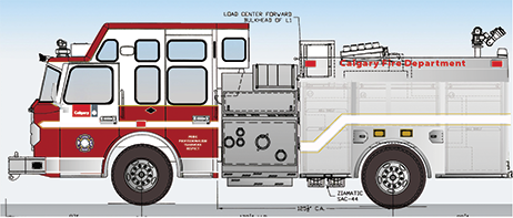
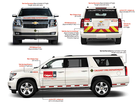
Vehicles
Fire vehicles are highly specialized so branding will be determined on a case-by-case basis. For information on other fleet vehicles, please visit Fleet vehicle guidelines.
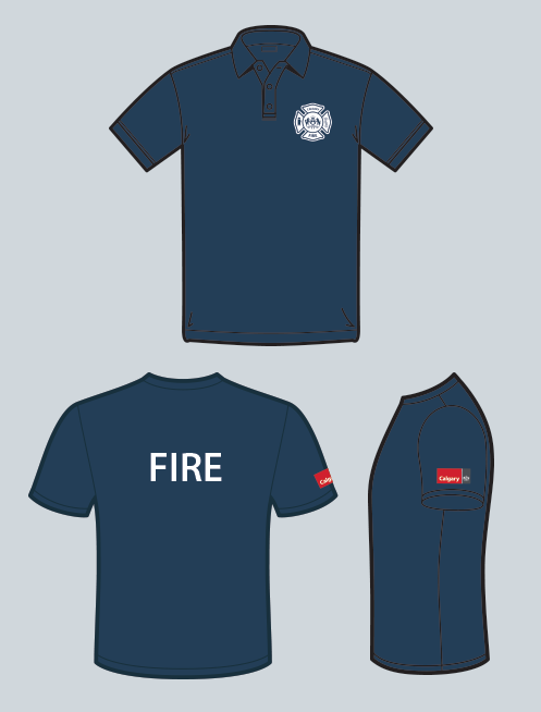
Athletic wear
As part of our One Voice initiative, do not put the Visual Identifier and department name together. To make sure the department name is legible from a distance it is to appear on its own. Fire is set ion the back n uppercase letters (for visibility) in Myriad Pro Bold.
NOTE: A specific identifier has been developed for embroidery use.
To meet detailed stitching requirements the recommended size of the Visual Identifier is:
- Three inches wide on golf shirts,T-shirts, jackets and some outerwear.
- Four inches wide for items that are silkscreened.