Visual identifier usage
Selecting the proper visual identifier for your application is important to maintaining the visual identity standards. Equally important are the guidelines that limit how you modify or place the visual identifiers.
This section outlines the do's and don't's of The City of Calgary's Visual Identifier placement and usage.
Visual identifier clear space
Maintaining appropriate clear space around the Visual Identifier is an important part of placement. The clear space defined below must be maintained any time the Visual Identifier is used.
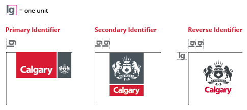
One unit of clear space is calculated by creating a square with a width and height equal to the vertical measurement from the top of the letter “l” to the bottom of the letter “g” in the Calgary wordmark.
Placement
The Visual Identifier must always be placed in the upper left-hand corner, bleeding off the top edge. The Reverse Identifier is an exception and never bleeds off the top edge.
The distance of the Identifier from the right edge of the page is calculated by the clear space. One unit of clear space is calculated by creating a square with a width and height equal to the vertical measurement from the top of the letter “l” to the bottom of the letter “g” in the Calgary wordmark.
Minimum sizes
To ensure legibility the Visual Identifier should never be printed or used digitally, smaller than the minimum sizes specified below.

Partnerships
There are two types of partnership treatments for The City of Calgary Visual Identifier – The City as the primary partner or as an equal partner. When The City is the primary partner the Identifier remains top left bleeding off the top edge with sponsor logos removed from it. When the City is an equal partner the identifier can appear beside the other sponsor logos and does not need to bleed off of the top edge.
When placing the Visual Identifier next to a partner logo always ensure that you use the minimum clearspace as a buffer. One unit of clear space is calculated by creating a square with a width and height equal to the vertical measurement from the top of the letter “l” to the bottom of the letter “g” in the Calgary wordmark.

The City of Calgary as the primary partner
To ensure legibility the Visual Identifier should never be printed or used digitally, smaller than the minimum sizes specified below.
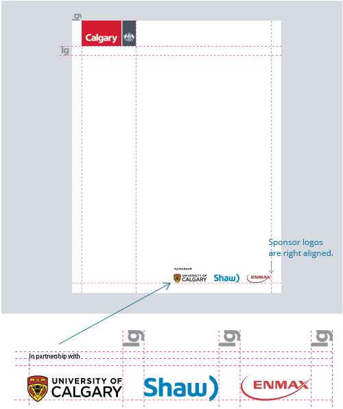
The City of Calgary as an equal partner
When The City of Calgary is an equal partner, all partner logos are shown side by side with equal prominence. Use the height of the Visual Identifier bounding box to determine the height of the accompanying logos. The spacing between the logos is determined by the clearspace of The City of Calgary Visual Identifier (one unit).
The words “In partnership with” should appear above the sponsor logos and be left aligned. The font should be Myriad Pro regular or semibold and never appear smaller than 8pt.

Incorrect applications
All usage and instances of The City of Calgary Visual Identifier must maintain consistent application across all media. When using The City of Calgary Identifier, avoid manipulating or changing it. Examples of incorrect application are shown below.
Do not remove the bounding boxes.
Do not scale logo smaller than 1" wide for print or 85px wide for digital banners.
Do not alter or change the colours of the visual identifier.
Do not change the proportions of the visual identifier.
Do not print the wordmark or Coat of Arms in a colour other than white.
Do not add or place elements within the visual identifier.
Do not place the visual identifier over complex backgrounds or images which will affect its readability.
Do not place the visual identifier over any background that doesn't provide sufficient contrast with the red or grey.
Do not use the Coat of Arms without the Calgary wordmark.
Do not switch the colours of the visual identifier.
Do not rearrange or change elements of the visual identifier.
Do not skew, compress or stretch the proportions of the visual identifier.
Do not place additional text or elements in the visual identifier's clearspace.
Do not add additional effects or filters like drop shadows or lens flares to the visual identifier.
Do not create outlines or keyline around the visual identifier to create contrast.