Block banner
The block banner component serves as a dominant visual element of the page containing images and call to action links or videos.
Component data
Global resources:
cicon-package.zip | bootstrap-grid.css (4.4.1) | jquery-3.6.0.min.js
Component resources:
SCSS files
Functional grouping: Containers
Demo
Configure: select the dropdowns below to display the variety of options that a block banner supports.
Code
Responsive preview
Usage best practices
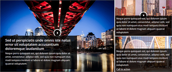
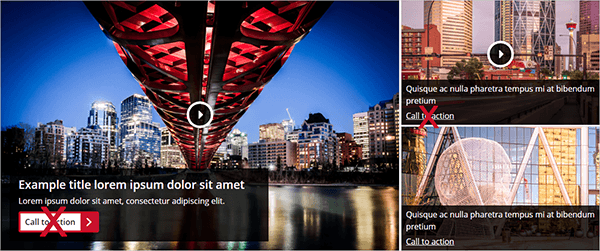
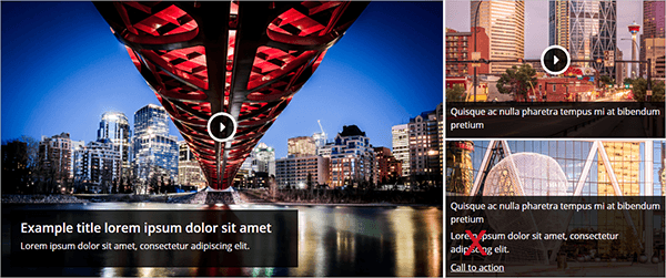
Block banners are composed of three boxes and are designed to be placed at the top of a page beneath a page heading.
Each box contains either a high quality background image or a video as well as a heading. The main box may contain a short description as well. Boxes that contain a static image require a single call to action link inside the content area. A link in the main box is styled as a primary button.
Boxes with videos, do not include any call to action links in the content area as the only action intended is to watch the video. When the video container is clicked, the video displays and plays.
Do
Use only high quality background images or video.
Use only one call to action link or button per grid item.
Add a short description to the main grid item.
Apply character limits on the content to reduce visual clutter:
- Title: 50-60 characters
- Description: 100-120 characters
Don't
Do not use a call to action link or button in conjunction with a video grid item.
Do not add a description for the side grid items.
Do not use multiple block banners in one area of a page.