Charts and informational illustrations
To strengthen and unify the City of Calgary brand across all channels, it is strongly recommended to begin by using the primary colour palette when creating charts, graphs and iconography. For charts and graphs you can also use shades of the black, grey and red. By limiting colours of simple charts to red, grey, black and white we are reinforcing the visual brand language and building awarness with citizens that the message is coming from The City of Calgary. Over time this will help build consistency and recognition of our brand.
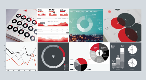
On more detailed or complicated charts additional colours will be required beyond the red, grey, black and white to cleary convey information. Too many shades of grey or red may be difficult for the viewer to differentiate. When this is the case you can choose colours from the secondary colour palette and their approved shade variants. Only use the neccesary additional colours sparingly to cleary communicate the information along with the primary colour palette. Examples with charts created using one or two colours are shown after the colour palettes sections.
Colours for use on informational illustrations
On detailed informational illustrations that need to convey a concept or information visually, all colours and shades can be used. This allows for more detail and flexibility when iconography or charts may not be enough to convey the message. Although illustrations can utilize the full spectrum of colour, any incorporated text must stay within the primary colour palette.
Find our more about The City's colour palettes:
One/two colour charts and iconography
Examples of how to communicate clearly without overusing colour.
Informational illustration
Detailed Illustrations can utilize the full colour spectrum as needed.